Showing posts with label tim holtz. Show all posts

Thursday, February 19, 2015

London Calling - cards with british techniques

I really had a great time being a guest artist for Club Scrap with the London Calling Greeting to Go set.  You can see all of my finished cards on the Club Scrap blog.  I'm going to feature a few here with some extra details on the techniques.

I'm not actually part of the hop this month, so if you got lost along the way, check out Kay, who follows me when I participate!

My first technique features some cards made using a Lace' template:


I found these Lace' templates in a craft store somewhere in England.  For the first card, I taped the template to the light green cardstock, and cut around the outside and one side (a different template - not shown - was used for the second card).  I'm working on the backside of the card, and I've used the neon blue ink to stamp the text stamp to add some interest.

After trimming both sides, it looks like this.

Using a bone folder, I folded back the outer triangle and tucked it into the inner triangle.  It works best to have a nice contrast between the back and front, so I did darken up the back by using some darker ink and stamping more text.

I thought it needed a bit more embellishment, so I punched out some hearts, and added those in the empty spaces.

I traced around the template, and used a craft knife to cut a mat for the piece.  These particular templates are no longer being made, but the Cut, Fold, and Tuck dies from Spellbinders will do all of the cutting for you, making this a much easier project!

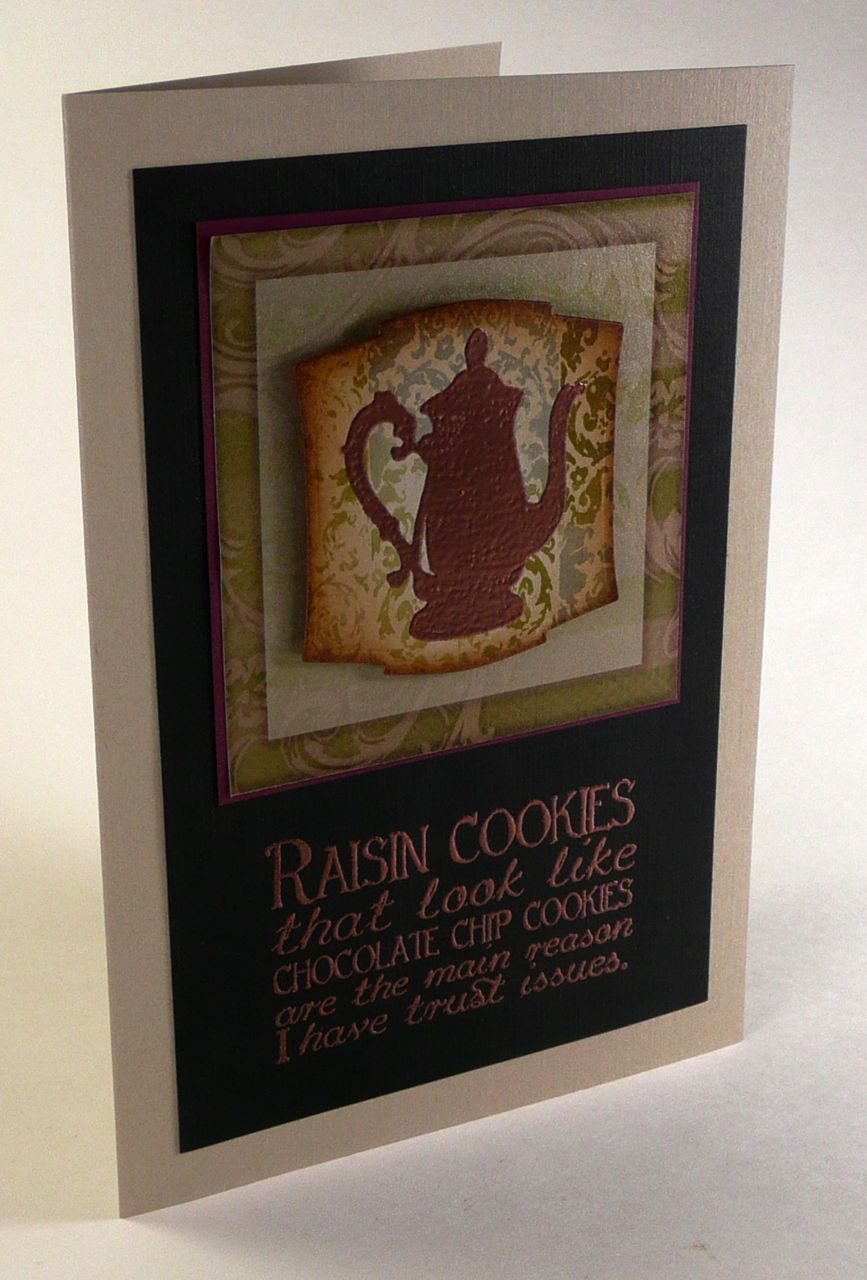
Many of the stamps in this kit have a great vintage feel to them, so I had a great time using some distress stains to make backgrounds for two of the card panels.  I just dabbed some distress stain in vintage photo, peeled paint, and broken china on a non-stick craft mat, sprayed with water, and swabbed up the color to make two panels.  I dropped water on the backgrounds and sprayed them a bit after drying to create a little more blending and texture.

I used a variety of images from the London Calling stamps to create the background, making sure to use different colors of distress ink (vintage photo and walnut stain) and to spray some of the images to create a bit of random fading and blurring.  I did use an ink blending tool and distress ink around the edges after this to create a nice ink frame around the panels.

I used the frame image from the kit to frame the sentiment.  I embossed the sentiment so I didn't need to worry about whether my image was dark enough to cover up the frame image.

I finished these up with embellishments from the kit for two gorgeous cards.  I love how they started out with the same techniques and colors, but still have a different feel to them.


My last British technique to share is decoupage.  You can find sheets of these in nearly every crafting store.  In America, the Paper Wishes company sells these as Paper Tole.  In England, the technique means to layer progressively smaller images on top of each other to create stunning depth in your cards.  Some stamps, like the one from the main collection sheet, also lend themselves to this technique.

Start by stamping your image on multiple pieces of paper.  My base image will be the blue image since the sky and water are blue (no coloring!).

I added a bit of gloss and shine to "London" by using a clear glue (like Glossy Accents) that was already died red.

For the second layer, I colored the postmark and the bridge.  I don't need to worry about staying in the lines, since I'll be cutting portions of the images out.  I wanted my big ben to be nice and bright in the front, so I didn't color the third image.

Next, trim your images out.  I didn't worry about trimming around the spikes on Big Ben.

Layer all of the images together using foam tape.  You can see the depth of the images here, with Big Ben two layer above the base of the card, but the bridge is only one layer up.


It doesn't take much to finish this card when you have such a fabulous focal image.

If you're not into the work of doing a scene, cutting out a single image and mounting it on foam tape can also be stunning.

The red coloring on the telephone booth and scattered dots in the background comes from a British product - Derwent's inktense blocks.  They are a permanent ink in a block form - you work with them like watercolors.  While wet, you can blend them, but once dry, they have a super intense color and are permanent.  This makes layering colors really interesting.  They also make them in pencil form. We toured the Derwent factory on our honeymoon (isn't my husband perfect to take me to crafty places on our vacations?), so their products hold a special place in my heart.

I hope you enjoyed my tour through some of the details on these cards, and that you have fun creating cards and works of art with the London Calling kit!

Wednesday, September 25, 2013

Take Wing Blog Hop - A dimensional book

Thank you for joining me for the Take Wing blog hop sponsored by Club Scrap.

Each month, their kits inspire me to try new techniques and practice old ones in new ways.  The Take Wing collection inspired me to make a book. This book is a twist on a dimensional book I developed a few years ago (my older posts have full tutorial details).


It uses several layers of bookboard on the cover to create a dimensional niche.  The thick covers and size of the pages reminds me of "big-little" books I used to read.


Three layers of thinner bookboard are used on the cover.  Between the second and third layers I placed punched circles to simulate clouds, and the bird was mounted on a piece of bookboard to lift it above the clouds (but below the surface of the cover of the book).

For the inside pages, I cut a 12 x 12 sheet into 4 x 6 pieces and one 8 x 8 piece for the back cover. On the 4 x 6 pieces, I used a Sizzix die to cut a fancy edge.  This creates a little extra space in the book, and a cool decorative effect.  Because the pages are 4x4, they are perfect for showcasing a photo collection.


What else did I use here?

  • A chicken wire stencil from Crafter's workshop for the textured pattern on the cover
  • I used a brayer with a foam attachment and a Kaledacolor ink pad to create the vibrant stripes
  • The Be Still stamp from Club Scrap for the swirls (I used the wood stamp, but similar swirls are still available on this lovely unmounted sheet)
  • Club Scrap Retreat stencil from 2011(no longer available) for the bird - traced onto shrink plastic first
  • Elements of Style stamp from Stampin' Up! for the swirls on the bird - be sure to use StazOn ink for stamping on shrink plastic. It just works best.

Next on our hop is the fabulous Debbie Weller.  I can't wait to see what she has planned for this month!

If you want to start back at the beginning, or have lost your way, please check out the Club Scrap blog for the full listing of participants.

Monday, April 29, 2013

More collaged backgrounds

Before I made my misted backgrounds last week, I experimented a bit with my new distress stains to see what kinds of effects those would yield.

I started by applying the stain through stencils, and then applied stain to stamps.  I used broken china and vintage photo here.  I also used the tattered leaves die to make some leaves for my cards.

On this card, I started with the same harlequin stencil, but then I used a CS stencil with ink and the Postcards from Paris stamps with ink to add a bit more definition in the background.  The blue panel was hand stamped with the same Postcards from Paris stamps in white pigment ink.

I'm wondering if I can get some of the same effects with watercolors.  I love the stains, but I already have lots of watercolors on hand.  If only I had more time to play...

Be sure to some back on May 4th.  I'll be sharing a mini-book I finished recently as part of the Club Scrap blog hop for National Scrapbook Day.  Mini-books make great gifts, and Mother's and Father's Day are closer than you think!

Monday, July 23, 2012

The Bon Appetit Menu - stamps and aging techniques

I had so much fun making cards with the Bon Appetit collection.  I was a bit stumped how to use the menu stamp, but the sentiment that goes along with the collection gave me the inspiration.

Start by inking the menu stamp - I used the Club Scrap india ink for a super dark black that won't run when I start aging the menu.

I want my menu to look aged, so I dab a cloth randomly on some different areas of the stamp.

I love how this looks after stamping.

Now, the fun begins!  Tear the paper to create a lovely aged effect.

Spray with whatever mists you have on hand that give that lovely aged appearance.  My sprayer wasn't working well, so I got these lovely spots that were perfect.

I used some distress inks to add some depth to my color.

Use a bamboo skewer (or whatever you have on hand!) to roll the edges up a bit.

I added some ink to the exposed areas from the backside and a little ribbon "clostheline," compete with closteh pins (I used half of the pin to add a little less dimension).

All stamps and paper from the Club Scrap Bon Appetit collection.

Hope you are enjoying the summer.  We're still knee deep in our remodeling project.  Should be great when it's done!

Wednesday, June 27, 2012

One technique - three cards

Club Scrap invited me to be the guest blogger this week, and I thought it would be fun to show you more of the techniques I used to create the Greeting to Go cards this month.  Over on their blog, you'll see one technique two ways, and here I'll show you how I made three cards with one technique.

I started by putting some distress ink (Vintage Photo, Peeled Paint, and Weathered Wood) on my Ranger non-stick craft sheet.

Spritz with water to get the colors to blend - wow do they pop after a bit of water!  I put my stamp on a grid ruler so lining it up would be easy while stamping.

Press your stamp in the "ink pad" on your craft sheet, and ink away!

I kept rotating the stamp and cleaning it so the pattern wouldn't be uniform.

I added a little more ink, but less water to create a second panel.  Adjusting the water can really change the stamped image.  I like both of these, but they definitely look different.

For my first card, I cut a lot of circles with a punch.

The edges were inked with vintage photo distress ink to give a bit more depth.  My handy grid ruler helped me find the center of the panel:

And to align the rest of the circles.  This part was inspired by another blog post using circles on a card.

To make the edges a bit glitzy, I rubbed versamark ink onto the edges, and then sprinkled gold embossing powder over the edges.


Add a bow, and you're done!

To create the other two cards, I die cut pieces from the paper to fit stamps.

These images were embossed with copper embossing powder.

A little distress ink on the edges helps to add depth.

Add some embellishments and a greeting, and you've got two more great cards.


I love how this kit can be used for vintage-y feeling cards, as well as for bright and cheerful cards.  Check out the Club Scrap blog on Wednesday to see a totally different vibe for the stamps and paper from the Bon Appetit collection.

LinkWithin

Related Posts Plugin for WordPress, Blogger...