Wednesday, December 30, 2015

Navigation blog hop - A junk journal for traveling

I'm not sure if this is a junk journal, hand stitched book, or something else, but my internet searching for inspiration turned up a lot of posts titled "junk journal," so let's call it that! Thank you for joining me for the Club Scrap blog hop featuring the Navigation kit.  If you picked up my post in the middle, check out the full list on Club Scrap Creates.

When I last went to England, I took a "smash" like journal with me, and had a lot of fun writing and stashing memorabilia in it.  Karen's project at Club Scrap Retreat also inspired me to create my own book with space for storing stuff and writing my memories.  If you want to see how it's made, check out my picture tutorial.  If you want to see more of the inside of the book, skip to the bottom.


 I started by cutting two covers (8.75" x 5 5 5/8") and one spine piece (8.75" x 1 5/8").


 On the spine piece, I pierced 3 holes in a line - 7/8" from the top and bottom and in the middle.  Since the spine piece was narrow, I rested my ruler on the covers so it would be easier to balance.


 The outer holes were 0.25" from the edge of the spine and the inner holes were spaced 3/8" from the outer holes. You can see a template on the left, with the pieced spine on the right. The circles on the template were where I pierced.

 I glued the spine piece to a piece of the green paper from Navigations that measured 5 1/8" x 10.25".  Don't forget to repierce the holes!

The covers were glued to the dark green paper so there is a 1.5" overhang, and then the remainder of the covers had a light green piece of card stock (4.75" x 10.25"). The corners were clipped, and wrapped around to form the basis of the cover.

(At this point, if you want a ribbon closure for your book, I recommend gluing it to the board now - I forgot!!)  I covered the inside with the fabulous map paper on the left side, and created a pocket for the right side.  The pocket piece is 12" tall, with a score at 8.5".  The pocket piece is 5 1/8" wide, with 3/4" flaps on the bottom (below the score line).

Fold the bottom up and the flaps around the back to form the perfect pocket. If I was Kay Williamson, I would have stamped that empty spot on the bottom before assembling to create the perfect embellishment.

Here is what the inside of the cover looks like when complete - I pressed this overnight and repierced the holes in the spine.

I then created 4 signatures to stitch into my book.  There is nothing magical about these - to make it simple, you could just use 8.5 x 11" paper folded in half.  Mine have several different pocket constructions, and had the following four pages each:
  • Outside page: 8.5 x 11 piece of paper folded in half
  • Large pocket page: 10.75 x 12" piece of paper.  Score at 8.5 and fold up the skinny piece.  Fold the 10.75 x 8.5" piece of paper in half
  • Inside page: 8.5 x 10.75 piece of paper folded in half
  • Inside pocket: create a pocket from a 5.75 x 10.75 piece of paper.  Create a 0.75" flap on two edges, and along the long edge, remove a 5 x 0.75" strip so the 0.75" flaps will fold around the smaller piece to form a pocket
From one outside page, pierce a hole in the middle and 0.75" from the top and bottom on the score line.  Use this as a template to pierce holes in all of the other pages, noting that the inside pocket pages are shorter than the regular pages.

Each signature looked like this (burgundy is outside page; gold is large pocket page; kraft is inside page; brown is inside pocket)- note how the inside pocket page is not assembled at this point (the tabs on the inside pocket page have the printing on them - I trimmed a corner off before stitching to make it easier to put things in and out of the pocket).

Each signature was stitched using a pamphlet stitch. Starting from the middle hole, I stitched from inside the pocket to the outside of the book.  Then, I stitched from the top hole into the book, back out through the middle hole, and then back in through the bottom hole. I tied the tails of waxed linen thread together to secure the signature.  Repeat for each line, making sure you use one vertical line of holes each time and that the pockets are facing up!

When you're done with one signature, trim the tails of thread, and attach the flaps to make a pocket - a nifty side effect of this design is that your thread is hidden.


At the end, your book will look like this on the spine:

And like this on the edge - see how the four signatures are stitched, and there is a nice gap between them?

The Navigation Lite kit doesn't have enough paper to make all of inside pages, and I didn't want to cut all of it down to 8.5 x 11 to make the book.  Other papers were from To You With Love, Equestrian, Comfort Zone, and Academy.  Inside the front cover, I used Club Scrap gold pigment ink to create my own collaged background with a variety of classic stamps (London Calling, All Aboard, Sail Away, and Postcards from Paris) and incorporated the long cut apart into my own unique cover page.

The book looks pretty impressive when fanned out - I can't wait to fill it!

The large pocket pages are the perfect home for the envelopes from the Navigation kit (oops - forgot to show one in the book here!).

The inside pocket had a slash cut in them so I could easily place a large "tag" for later embellishment or journaling. Cut the slash before stitching.


The back pocket holds a Navigation envelope with a variety of cut aparts from this and other kits.

Since I forgot to attach my ribbon in the usual place, I put a cut apart from the Orient Express kit on the back to attach the green ribbon from the Navigation Lite kit.

I added some buttons from the Transformations kit on the spine to add some bling to the spine. The original plan was to tie together all of the exposed linen thread, but I didn't leave enough slack to do that.

I really love how the colors and themes of this month's kit blended beautifully with so many old and new kits.  I hope you enjoy the next stop on our hop - Marya Kaszubinski at A Notebook Novel always has something great to share!

Saturday, December 19, 2015

Watercolor Christmas - a Club Scrap blog hop

I just love the Christmas stamps that Club Scrap releases each year, and this year is one of my favorites - a Watercolor Christmas.  If you found me from the Club Scrap blog, you are in the right place.  If you'd like to start at the beginning, then head back to Club Scrap and I'll be waiting right here for you.

The tree image immediately struck me as something that would look fabulous with the color burst powders I learned about at retreat (join us next year!).  If you missed my post earlier this week, I featured some of the cards I made using those.

For this technique, I created my own resist paper by embossing the tree image in white on kraft paper.

Then, I just tapped a small amount of color onto the paper - you can barely see it, and that's just right.

Spray with water, and watch the magic happen!

I let these pretty much dry as they were, and then wiped off the color that was on top of the embossing later.  Even with machine embossing, you will end up with little defects in the coating that will give you spots - it's all part of the charm.

I did a lot of different samples in my experimenting with different embossing powders, but basically the sky is the limit.  I loved the high contrast images on the right the best.  The circles look fabulous when filled in with a bit of stickles - clear stickles will allow the background to shine through, but colored stickles can create a really nice accent.

As you go along, be sure to mop up the extra color with a spare piece of cardstock. This is one of several fantastic sheets I ended up with.  They won't look great when they start, they might not look great when they finish.

Once you cut these beauties into smaller pieces, however, the magic happens for me.  I embellished this piece with some white snowflakes in pigment ink from a classic Club Scrap Christmas kit, the greeting stamp from Watercolor Christmas was embossed in black (I love high contrast!) and a bit of baker's twine and an embellishment finished it off.

I bought this set of stamps because I was in love with the cardinal image, but I have to admit that I wasn't in love with it the first few times I stamped it.  I'm a high contrast girl, and there wasn't a lot of contrast in this image. My secret to a great image, however, was found when I used my zig pigment markers to color the image.  Use a variety of colors and blend them on the stamp.  I used some glossy accents in black to create a shiny eye, and added some stamps around the edges.  Perfection.

I wish you all a blessed holiday no matter what holiday you celebrate, and a happy new year filled with fun crafting days!

Our next stop on the hop is the delightful Jac Carney, Club Scrap's awesome designer. I can't wait to see what she has come up with this month!

Monday, December 14, 2015

Color Burst Powders - quick and easy cards

When I at the Club Scrap retreat this year (registration for next year's is open now!), one of my favorite classes was with the delightful Tricia Morris.  She introduced us to color burst powders.

One technique we learned in class was to emboss a panel using an embossing folder, rub some oil pastels over the top, and then sprinkle with powders and spritz with water.

I love these classes because I learn a technique in Wisconsin, and then I bring the panels home to finish making the cards with my own stamps and embellishments.  Doesn't the white pigment ink look fabulous on the black paper?

In order to use the card design I wanted, I needed to trim a little off to make them "fit."  So, I had lots of strips left over.  I combined them into one panel to make yet another card. This card also uses the wonderful gold pigment ink Club Scrap introduced this year.

You can also combine the color burst powders with stencils and masks for some really great effects.

And, of course, you can just play with swiping up color from a craft mat, or sprinking to make fabulous backgrounds.  This was embellished with some classic stamps from Club Scrap.

As you go along, you create quite a mess.  It's great to have a piece of cardstock ready to swipe up all of that gorgeous color.  Then, you can make even more fabulous backgrounds for more cards. This text stamp is embossed in white on top of the color burst background, and this makes it just pop.


Come back on Saturday to see how these powders inspired me to play with the Watercolor Christmas stamps from Club Scrap!


Wednesday, September 30, 2015

Transformations Blog Hop - Transforming the kit...

Welcome to the Transformations blog hop, featuring the latest Club Scrap kit.  I love the warm greens, browns and turquoise in this kit, and particularly fell in love with the buttons.  I decided to transform this kit into some cards that you might not think of at first glance.

First, I thought pretty simply about a sympathy card.  I used the ocean and spruce inks on my stamps to give a little depth to the stamping, and used the pop up adhesive in my kit to lift the banner.


Next, I thought about fall birthdays, and (for me!) went a little crazy with layering some punches, dies, ribbon and the button (doesn't it look cute with some baker's twine?).  The background was just stamped with versamark and rubbed with some gold pan pastels.


Finally, if you mix a little red in with the kit, I think you have a fabulous palette for a Christmas card! It probably won't show in the photo, but I used a wink of stella pen to put just the tiniest amount of sparkle on the card.


All of the stamps are from older Club Scrap collections, showing that you can use your stamps with other kits!  Maybe you're not like me, but sometimes I think my stamps only belong to the set of paper they came with!

Hope you enjoyed my look at Transformations - next on our hop is Ink Stains with Roni.  If you get lost along the way or want to check the hop out from the beginning, check out the main Club Scrap post.

Wednesday, August 26, 2015

Woven Strands Blog Hop - a card collection

Welcome to the Woven Strands blog hop featuring Club Scrap's Woven Strands kit.  This month has been crazy for me - it was such a joy to get this kit and create some cards! The paper in this kit has colors and textures and shimmer that I just love.  The stencil makes a stunning background.

And, more fun with the stencil on a smaller card.

The cutaparts to me looked like great items to use as embellishments for this card, along with the ribbon and a happy birthday stamp from my stash.


My birthday was this month, and I was gifted with new crafting supplies - including this super yummy Ferro textured paint in silver and copper.  I couldn't resist using the stencil with it to create this border piece on this card.  I inked a portion of the stencil in the corner to add some more texture and color to the background.

I also decided to use some pieces from another silvered piece.  In person, the silver is so dimensional and sparkly.  It's really stunning.

A piece of it even ended up on a border strip I created on the "negative" image of the stencil.

I had a lot of fun playing with this kit, and was really inspired by the stencil and gorgeous colors.  Next up is Lillian at the Leaf Studio - I can't wait to see what she has to share with us!  Hop back to Club Scrap to see the full list of bloggers.

Wednesday, July 29, 2015

Cantina Blog Hop - notebook for a fountain pen and cards

Thanks for joining me today on the Cantina blog hop which celebrates the July 2015 Club Scrap kit - Cantina!  I hope you enjoyed hopping over to my blog from Hetty - if you want to start at the beginning, check out the full list of bloggers over at Club Scrap.

The sunny orange in this kit is remarkably complementary to my new orange pen and notebook, so I decided to make this sweet little case to protect it and carry my pen with me.  It's hard to find a pre-made folio to hold these larger pens, so this is why I love that I can make my own!

When it's open, you can see the pen loop on the left hand side (since I'm a righty).  This is a very easy construction - just two pieces of book board separated by a 1/2 inch gutter. I decorated with a cutout from the Lite kit.

The notebook slides out of a pocket (my pocket tutorial is here - this pocket is 1/4 inch wider than the book height), and I glued a piece of ribbon behind the pocket first, so I would have a handy little place marker.

I've recently decided to dip into fountain pens (pun intended!), and the Lamy Al Star or Safari ones are my pen of choice for now, since they come in so many bright colors (orange, purple, blue/green, neon coral, and more!) and they are affordable.  Many also have matching ink colors, too.  The Clairefontaine notebooks are also reasonably priced, and work well with fountain pen inks.

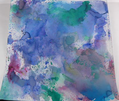
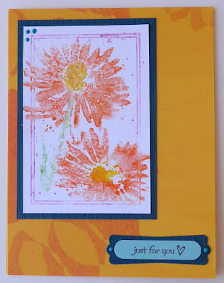
At the end of the book project, I had some odd scraps left over, and decided to play with making some cards.  The Watercolor Blossoms stamp set from the 2013 retreat seemed perfect to try out Kay's watercolor technique with my gelatos.  I got out a big sheet of paper, and just started playing.  This image is under 4 inches tall, so you could cut your paper into strips to make it easier to work with.

As you can see, some turned out fabulous, and some did not.  There is a bit of a trick to making sure you have just enough water to activate the watercolors, but not so much that things get splotchy.  Some images are fixable - I used a brush after the fact to put some more color on the left hand blossom in this shot.

When all was said and done, I have a lot of floral panels to make sweet cards like this one for my neighbor.

Our next stop along the way is Dishing with Janet.  Hope you enjoyed my post and the entire hop!  Hope to see you next month.

LinkWithin

Related Posts Plugin for WordPress, Blogger...