I just love the Christmas stamps that Club Scrap releases each year, and this year is one of my favorites - a Watercolor Christmas. If you found me from the Club Scrap blog, you are in the right place. If you'd like to start at the beginning, then head back to Club Scrap and I'll be waiting right here for you.
The tree image immediately struck me as something that would look fabulous with the color burst powders I learned about at retreat (join us next year!). If you missed my post earlier this week, I featured some of the cards I made using those.
For this technique, I created my own resist paper by embossing the tree image in white on kraft paper.
Then, I just tapped a small amount of color onto the paper - you can barely see it, and that's just right.
Spray with water, and watch the magic happen!
I let these pretty much dry as they were, and then wiped off the color that was on top of the embossing later. Even with machine embossing, you will end up with little defects in the coating that will give you spots - it's all part of the charm.
I did a lot of different samples in my experimenting with different embossing powders, but basically the sky is the limit. I loved the high contrast images on the right the best. The circles look fabulous when filled in with a bit of stickles - clear stickles will allow the background to shine through, but colored stickles can create a really nice accent.
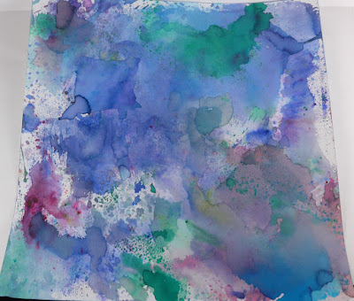
As you go along, be sure to mop up the extra color with a spare piece of cardstock. This is one of several fantastic sheets I ended up with. They won't look great when they start, they might not look great when they finish.
Once you cut these beauties into smaller pieces, however, the magic happens for me. I embellished this piece with some white snowflakes in pigment ink from a classic Club Scrap Christmas kit, the greeting stamp from Watercolor Christmas was embossed in black (I love high contrast!) and a bit of baker's twine and an embellishment finished it off.
I bought this set of stamps because I was in love with the cardinal image, but I have to admit that I wasn't in love with it the first few times I stamped it. I'm a high contrast girl, and there wasn't a lot of contrast in this image. My secret to a great image, however, was found when I used my zig pigment markers to color the image. Use a variety of colors and blend them on the stamp. I used some glossy accents in black to create a shiny eye, and added some stamps around the edges. Perfection.
I wish you all a blessed holiday no matter what holiday you celebrate, and a happy new year filled with fun crafting days!
Our next stop on the hop is the delightful Jac Carney, Club Scrap's awesome designer. I can't wait to see what she has come up with this month!


No comments:
Post a Comment